Add drop-downs
In Ibexa DXP, you can create a reusable custom drop-down and implement it anywhere in the Back Office. Follow the steps below to learn how to integrate this component to fit it to your project needs.
Prepare custom drop-down structure
First prepare the component HTML code structure in the template inside the content section:
1 2 3 4 5 6 7 8 9 10 11 12 13 14 15 16 17 18 | |
In line two, the code contains a hidden native select input. It stores the selection values.
Input is hidden because a custom drop-down duplicates its functionality.
Caution
Do not remove the select input, otherwise form submission may not work.
Generate <select> input
Next, generate a standard select input with the ez-custom-dropdown__select CSS class added to the <select> element.
This element should contain at least one additional attribute: hidden.
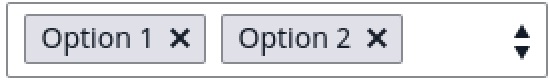
If you want to allow users to pick multiple items from a list, add the multiple attribute to the same element.
Example:
1 | |
Add attributes
Next, look at the data-value attribute in the code (line 11 and 12) for duplicated options with the CSS class: ez-custom-dropdown__item.
It stores a value of an option from a select input.
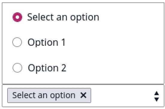
You can provide placeholder text for your custom drop-down. To do so:
- put a
data-valueattribute with no valuedata-value="" - add a
disabledattribute to the item in the duplicated list of options to make it unclickable.
Example:
1 2 | |
Initialize
To initialize a custom drop-down, run the following JavaScript code:
1 2 3 4 5 6 7 8 9 10 11 12 | |
Configuration options
Full list of options:
| Name | Description | Required |
|---|---|---|
container |
contains a reference to a DOM node where custom drop-down is initialized. | required |
sourceInput |
contains a reference to a DOM node where the value of selected option is stored. Preferably, it should be a reference to a select input node. | required |
itemsContainer |
contains a reference to a duplicated items container. | required |
hasDefaultSelection |
contains a boolean value. If set to true the first option is selected as a placeholder or selected value. |
optional |
selectedItemTemplate |
contains a literal template string with placeholders for value and label data. |
optional |
In the code samples you can find 4 of 5 configuration options.
Default template HTML code structure for missing selectedItemTemplate looks like this:
1 | |