User interface
Top bar
At the top of the main screen you can see a top bar.

Depending on your location within the back office, it can contain the following important features:
A. Logo in the left corner, which is a direct link to the dashboard
B. "Focus mode" badge which informs you that the focus mode is on
C. Global search field that allows you to find content by checking all searchable fields
D. Drop-down that changes the site context

E. Notification icon that informs you about incoming assignments, for example, items assigned for your review
F. App switcher which includes links to official websites of the QNTM group ecosystem companies, world-class ad-tech and mar-tech solution providers
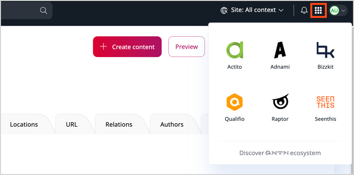
G. User avatar with a drop-down menu with access to user profile and settings
Site context
Changing the site context results in the content tree showing content items that belong to the selected website. The appearance of content items can also change if they use different designs or languages depending on the SiteAccess settings.
Dashboard
The first screen that you see after logging in is Dashboard. It's the default dashboard and contains selected blocks.
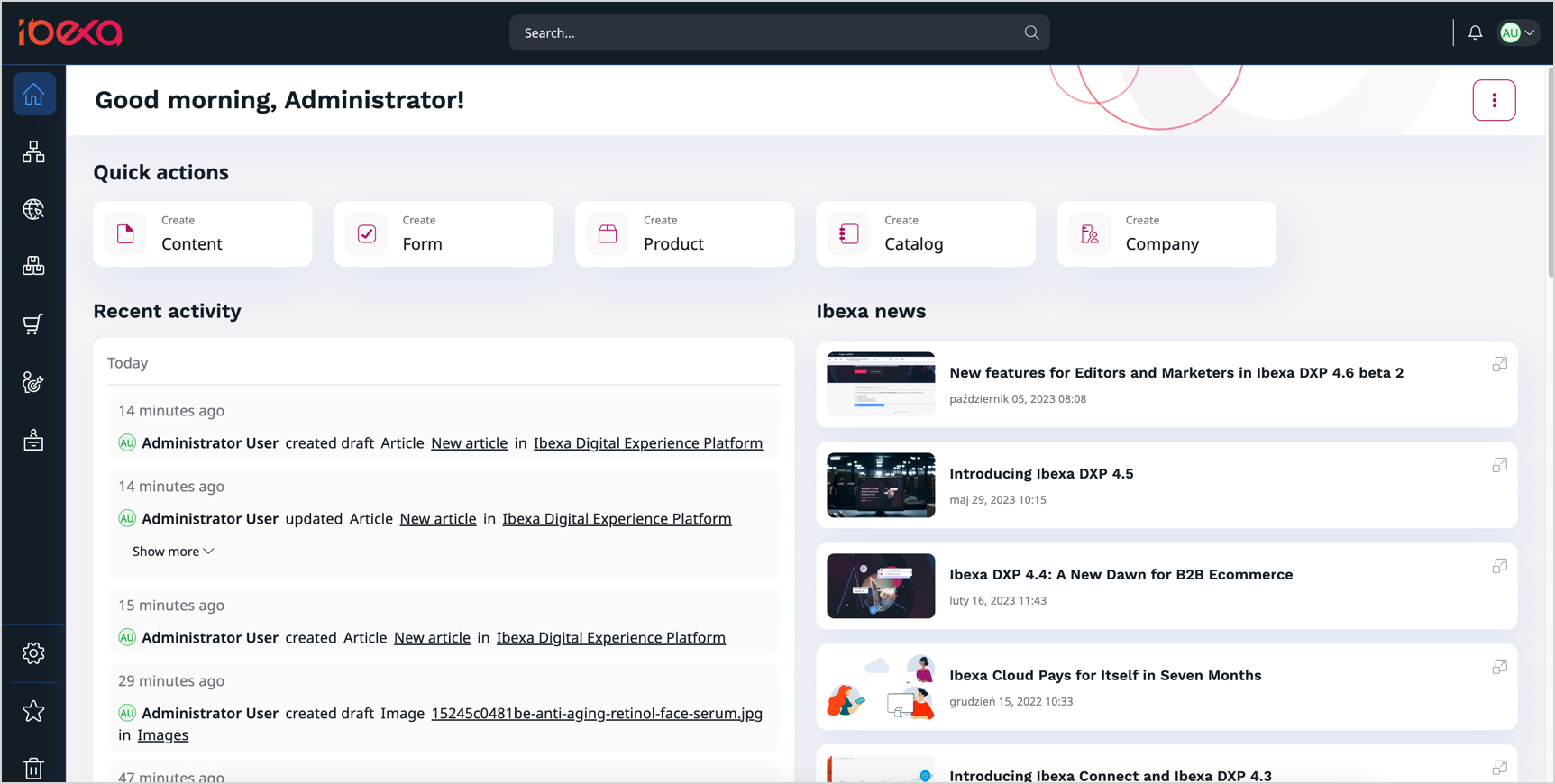
You can customize the dashboard by changing the blocks and the layout. For more information, see Work with dashboard.
Main menu
The main menu allows you to move between important sections of the application.
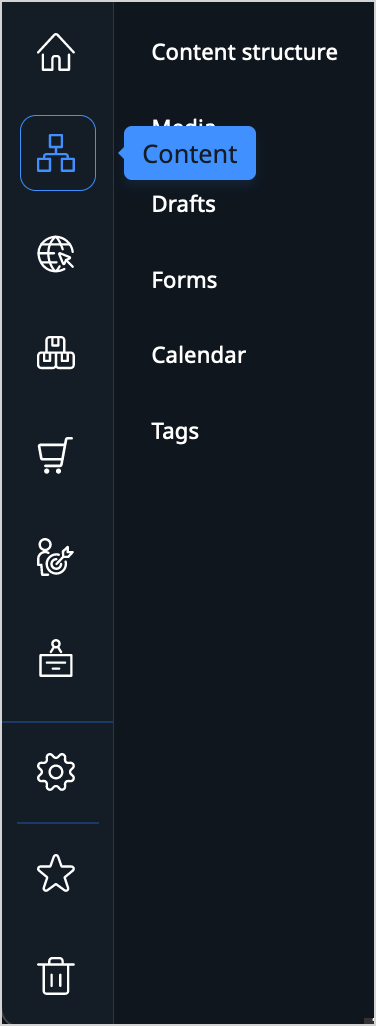
You can adjust the size of the menu sidebar. To do this, click on the side edge of the panel, then drag and adjust to the desired size. You can also hide it by clicking the button in the down right corner.
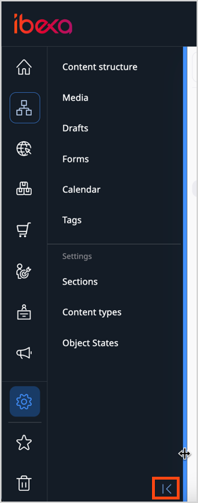
Depending on the product edition and your permissions, the main menu may include, for example:
- Content, which gives you access to the content repository. It lets you navigate the content tree, and, for example, create, edit, move, copy, or delete content.
- Site management, which enables you to create and edit block-based pages and manage multiple websites.
- PIM, which enables you to handle products presented on the website, including their specifications and pricing.
- Admin, which is the administration panel where you can manage, for example, Users, Sections, or permissions.
Content tree
Content tree is the place where you can navigate through all the content items in your application. It is available in the back office and allows you to browse your content, move content items around, hide them, send them to trash, and perform other actions.
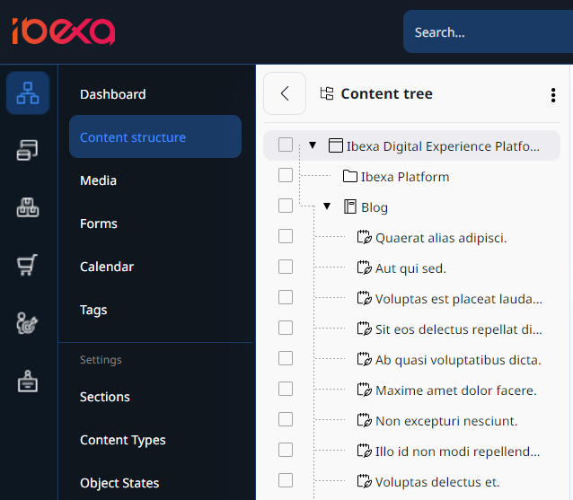
For more information, see Content tree.
Content browser
During your work with Ibexa DXP you might need to select content from the repository. This happens, for example, when you want to move or copy a content item, embed an image, or link two content items. In such cases, you use the Content Browser.
To access the Content Browser, go to the Content tab and select Content structure or Media. Then, select a file you want to copy or move and click the corresponding button in the top right corner. The Content Browser window opens, and you can select the new destination of the selected file or its copy.
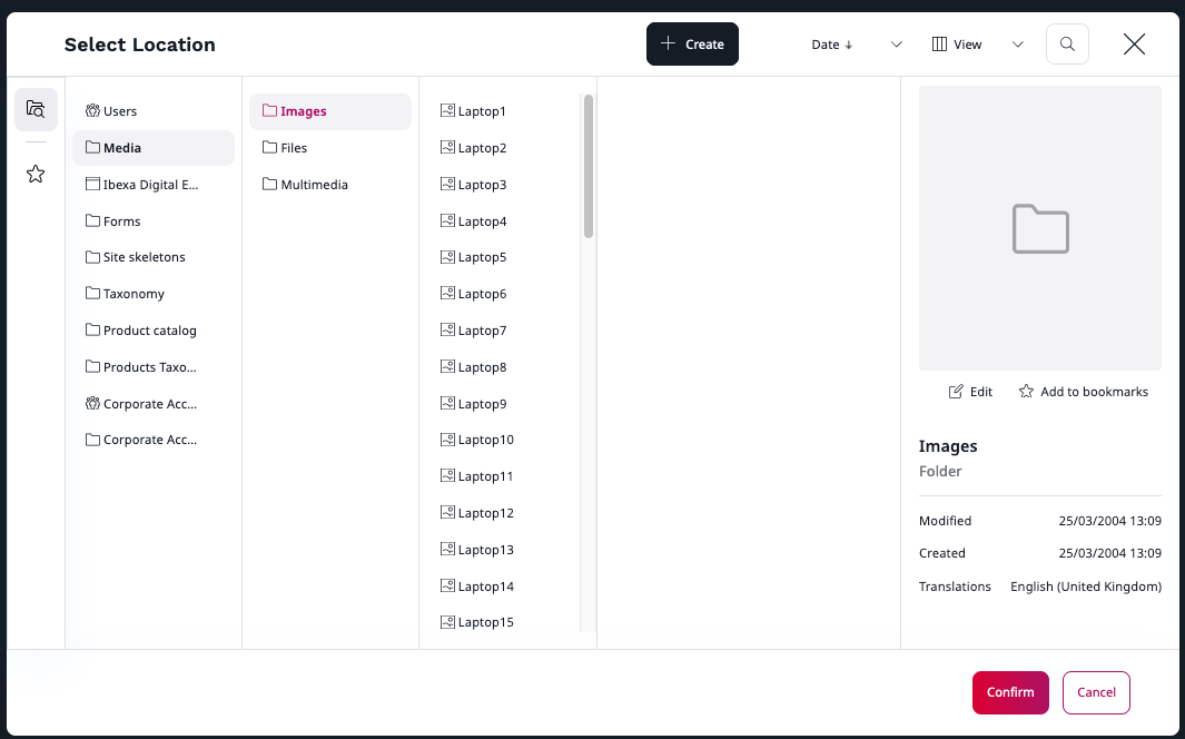
With the Content Browser, you can switch between the Grid, Panels and Tree views to navigate through the content of the website. Depending on your permissions, you might be able to see the regular content, media, forms, site skeletons, and user accounts. You can also use the Content Browser to search the repository for content, edit content, create bookmarks, and create new content when needed.
Note
If you have administrator permissions, you can also view and manage user accounts and site skeletons in the Admin tab.
For more information about users and permissions, see Users.
For more information about site skeletons, see Site skeletons.
Focus mode
Focus mode helps editors focus on information that is only relevant to their line of work and omit technical details that would distract. It's enabled by default, after you log in. If you need access to certain settings or technical details, you can disable the focus mode at any time.
-
- Dark theme for content tree
- In areas where the content tree is displayed, for example, in Content structure, the tree is displayed on a dark background.
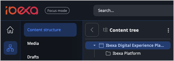
-
- Content item view
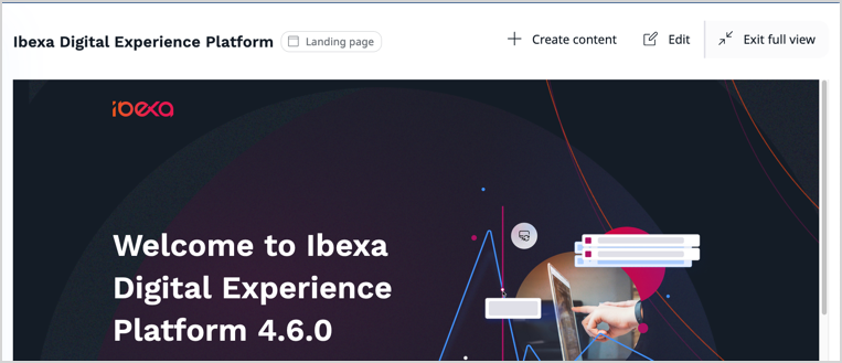
- If you select a specific SiteAccess from the Site context drop-down list on the right side of the top bar and then browse content items in content tree, they're displayed in full view, with a limited set of actions available. To display the content item details view with more actions, click Exit full view.
Tip
Even when you're out of the full view or not in Focus mode, you can still preview the content item in the View tab.
-
- Different details view tabs
- In Focus mode, the tabs in content item's detail view are different than the ones visible when it's disabled. Additionally, they're displayed in different order to expose the ones that are more important from the editor's perspective.

-
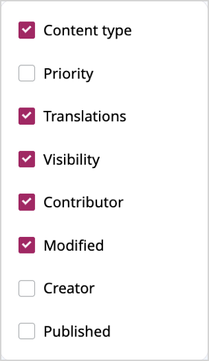
- Different columns available for selection
- You can decide which columns are displayed in the Sub-items table, to adjust the view to your use case. The list of columns available for selection is limited in Focus mode.
Disable Focus mode
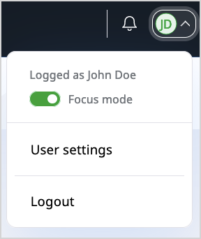
Focus mode is enabled by default when you first log into Ibexa DXP, but you can toggle it in two places:
- in user settings

- in the drop-down menu on the right side of the top bar
