Create and edit pages
Page is a special content type. You can modify pages with a visual drag-and-drop editor, the Page Builder. Pages are divided into drop zones into which you can drop various dynamic blocks. By editing pages, you can customize the layout and content of your website.
Whenever you edit a page, a new version is created in the repository.
Tip
The page content type contains a Landing page field type which manages the zones and blocks. Any content item that has the Landing page field type behaves like a page.
Create page
- In the left panel, go to Content -> Content structure. Then select a parent content item and click Create content.
- In a slide-out pane, make initial choices in the following fields, and click Create:
- Select a language - from a drop-down list, select the base language for the content item.
- Select a content type - use this field to narrow down the list of content type choices displayed below. Then select one of page type, for example, Landing page, and click the Create button.
- In the Page Builder toolbar click Fields and define the page's title and description.
- Click Switch layout and select the layout.
- Edit the page.
- To discard your changes and close the window, click Delete draft.
- To save your changes, click Save draft. You can now navigate away from the Page by clicking the Close button.
-
When the page is ready for publication:
- Click Publish to publish it immediately.
- Click Publish later to set a specific publication date.
For more information, see Publish content.
Autosave
To help you preserve your work, Ibexa DXP saves drafts of content items automatically. For more information, see Autosave.
Edit page
To edit an existing page, in the back office, from the content tree, choose the page that you want to edit, and click the Edit button.
Page Builder interface
Page Builder has a plain and intuitive interface. You can create pages without having advanced technical skills.
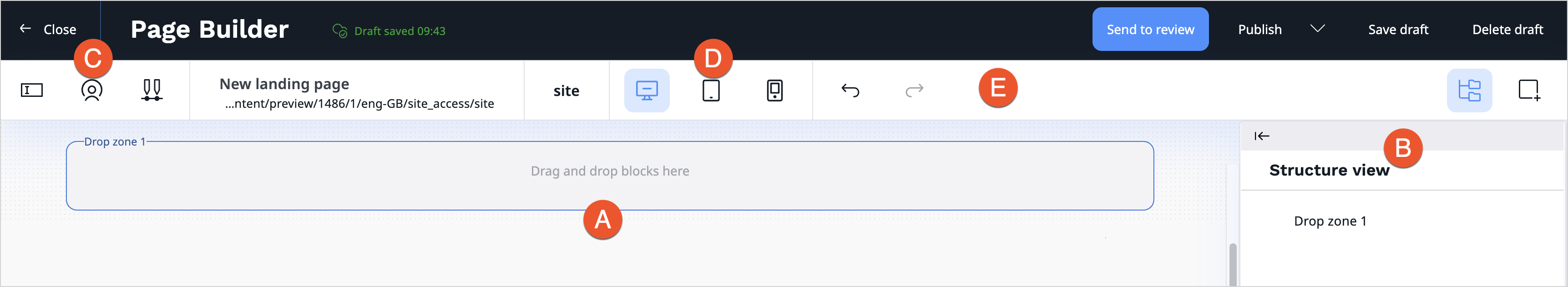
Page Builder user interface consists of:
A. Drop zone
B. Page blocks / Structure view toolbox
C. Settings toolbar (including Fields, Visibility and Schedule settings)
D. Device mode toolbar (including Desktop, Tablet and Mobile mode)
E. Buttons
The following table presents buttons and provides a short description of their function:
| Button | Description |
|---|---|
 |
Edit main details of the page, like title and description. |
 |
Switch between page layouts. |
 |
Access preview of the page for a given segment. |
 |
Access the timeline to preview how the page changes with time. You can also view the list of all upcoming scheduled events. |
 |
Toggle through to see how the page is rendered on different devices. |
 |
Move Page blocks / Structure view toolbox to the other side of the screen. |
 |
Undo latest change. |
 |
Redo latest change. |
Page Builder has two main views that you can use while creating a page:
- Page blocks toolbox - consists of all available elements that you can use by dragging them and dropping on a drop zone.
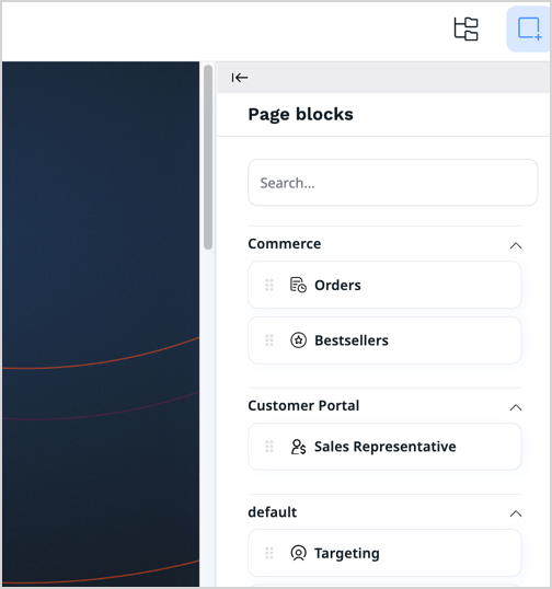
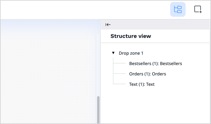
- Structure view toolbox - shows a structure of your page, including their division into zones and the blocks that they contain.
Work with layout
Layout divides the page into the defined zones. The zones are placeholders for the blocks.
The page layouts that an editor has access to are up to you to choose.
The default, built-in Page layout has only one zone, but developers can create other layouts in configuration. For more information, see Configure layout.
While editing, you can switch layout for your page. To do it, click Switch layouts button.
Add blocks
In Page Builder you can access a toolbox of Page blocks — a set of blocks of content that you can add to the zones of the page. Each block is unique in its function and enables you to customize the content appearing on the page.
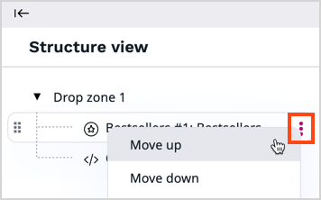
Add a block by dragging it from the toolbox to an empty place on a zone. Do not worry about placing blocks in the proper place from the start. You can reorder blocks later, in a few ways:
- drag and drop block in the desired location on a drop zone
- hover over the block and use 'Move up' and 'Move down' function in the settings of the block
- access Structure view toolbox and use 'Move up' and 'Move down' function in the settings of the block
When you add a new block to the drop zone, drop it in the blue highlighted area. Before you drop it, a bold line appears - it helps you see the position of the newly added block in relation to other, already added blocks.
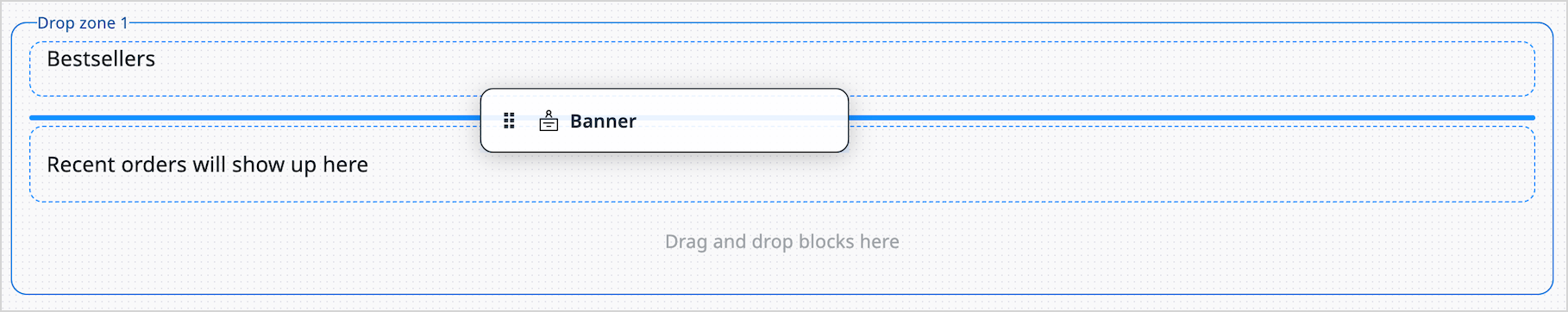
When you add a block by dragging it from Page blocks toolbox into the drop zone, the block settings panel open immediately where you can configure all block properties.
This is a default behavior. You can globally turn off automatic opening of the block settings panel in the user settings. First, access your user settings on the right side of the top bar:

Then, go to My preferences tab, Edit section.
Here, you can find Automatically open block settings in builder setting, which, by default, is set up to enabled value.
To change this behavior, click on Edit icon, find the setting, and change its value to disabled.

Ibexa DXP comes with a set of ready-to-use page blocks, but developers can add their own.
For a list of blocks available out of the box, see Block reference.
Note
Before you add a block that involves products, product types, or product categories, make sure your that your user role has the Product/View and Product type/View permission.
Before you add a block that uses results derived from a Personalization scenario, for example, Dynamic targeting or Recently added block, make sure that the scenario is properly configured.
You can work with the block, for example, duplicate it, change its position, or delete it. Hover over the block and the toolbar appears. Click the three dots icon to see more options.

The following actions are available:
- Move up block - allows you to change position of the block on the page by moving it up
- Move down block - allows you to change position of the block on the page by moving it down
- Block settings - allows you to access properties window
- Copy - allows you to reuse a configured block across pages by using the Clipboard section.
- Duplicate - duplicates existing block with its settings
- Refresh - refreshes preview of the block
- Delete - deletes existing block

Copy blocks
You can copy blocks to reuse them on other pages, or within the same one.
When you copy a block, it gets saved in the "Clipboard" section of the Page Blocks toolbox. At this point you can continue working on the current page, or you can close it and open another one, where you want to reuse the block. You can drag and drop the block from clipboard to a drop zone, like any other block. Doing so puts an exact copy of the block on the page, with all its settings.
The clipboard can store only one block at a time. Content of the clipboard is visible only to you, and preserves switching into a new session.

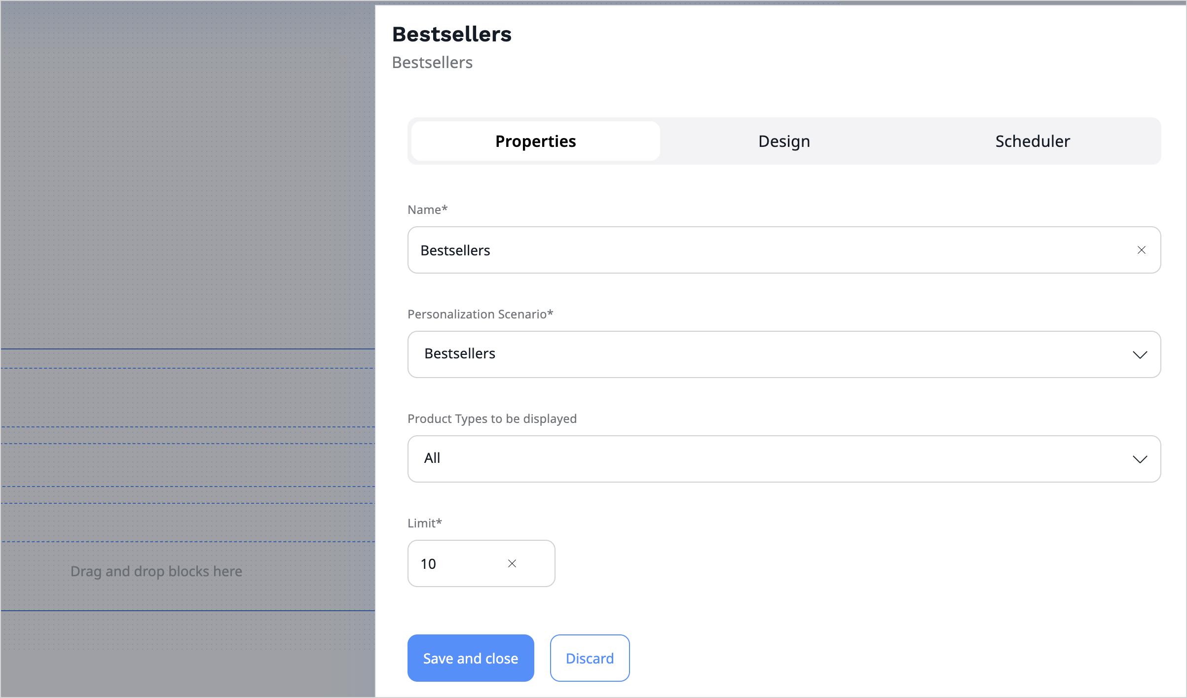
Configure block settings
Each kind of block has its special settings. You can access them by placing the cursor on the added block and clicking the Block settings icon.
Settings available for blocks are divided into three tabs — Basic, Design, and Scheduler. The settings available on the Basic tab are tailored to the block's content. For a description of these settings, see Block reference.
The remaining tabs contain parameters common to all blocks provided with Ibexa DXP. Use them to modify the layout and visibility of a block.
For more information, see Scheduling publication.
For your comfort, you can adjust the size of the block settings window. When you hover over the window frame, blue line appears. Click-and-drag the border to adjust the size.
You cannot publish a page if you haven't set all the required settings of all blocks.
Tip
Settings and function of custom-made blocks of content depend on their design. For details on adjusting and using them, contact your website administrator.
After you change the block settings, click Submit to save the changes or Discard to cancel.
Edit embedded items
You can edit embedded content items without leaving Page Builder.
To do it, first select content item that you want to insert in the block. Then, click the icon on the right side and click Edit.

This action opens a new tab in the browser with an editing screen of the selected content item. When you finish editing the item, click Publish and go back to Page Builder tab. All the content item details automatically update in the block window.
If the content item has more than one translation available, you need to select the language.

This function is available for following blocks:
- Banner
- Collection
- Content Scheduler
- Embed
- Gallery
- Product collection
- Targeting
- Text
Distraction free mode
While configuring blocks that include Rich Text section, for example, Text block, you can switch to distraction free mode.
Distraction free mode expands the workspace to full screen and shows only editor toolbar. It's helpful when you need to work with longer texts that take more space and when you want to focus your attention on editing text.

To access distraction free mode, click Distraction free mode on the right side above the workspace.

To exit distraction free mode, click Exit distraction free mode or press Esc on the keyboard.

Save page
There are several options for saving work on the page:
| Option | Description |
|---|---|
| Close | Close the page without saving it. |
| Send to review | Save the page and send it to review. |
| Publish / Publish later | Publish the page or schedule publishing for later. |
| Save draft | Save the page draft*. |
| Delete draft | Delete the page draft. |
- To help you preserve your work, system saves drafts of content items automatically. For more information, see Autosave.