Add drop-downs
In Ibexa DXP, you can create a reusable custom drop-down and implement it anywhere in the back office. Follow the steps below to learn how to integrate this component to fit it to your project needs.
Create <select> input
Set elements which are available for the <select> input, for example:
1 2 3 4 5 6 7 8 | |
<select> input must have the ibexa-input class.
The multiple setting is optional, but you should add it if the drop-down attribute multiple is set to true.
Define choices:
1 2 3 4 5 6 7 8 9 10 11 12 13 | |
If you need multilevel choices, use the following structure:
1 2 3 4 5 6 7 8 9 10 11 12 13 14 15 16 17 18 19 20 | |
To set preferred_choices, use the following:
1 2 3 4 | |
For value, see the example:
1 2 3 4 | |
Prepare custom drop-down structure
Next, prepare the component structure and place it in the template after setting the needed attributes. See the example:
1 2 3 4 5 6 | |
Drop-down attributes
The following attributes are available:
| Name | Values | Definition |
|---|---|---|
source |
- | What is currently defined in the <select> input header. |
choices |
- | Elements listed in the drop-down. |
preferred_choices |
Elements listed at the top of the list with a separator. | |
value |
- | The currently selected element. It is an object with a key value. |
multiple |
truefalse | Boolean. To allow users to select multiple items. |
translation_domain |
truefalse | Used for translating choices and placeholder. |
custom_form |
truefalse | For custom form must be set to true. |
class |
- | Additional classes for the element with ibexa-dropdown class. |
placeholder |
Placeholder displayed when no option is selected. | |
custom_init |
truefalse | By default set to false. If set to true, requires manually initializing drop-down in JavaScript. |
is_disabled |
truefalse | Disables drop-down. |
is_hidden |
truefalse | Hides the whole widget. |
is_small |
truefalse | Adjusts height of the widget (from 48px to 32px). |
is_ghost |
truefalse | Changes layout of the widget, removes all borders and backgrounds (similar to buttons modifier). |
min_search_items |
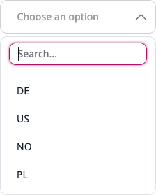
number, default 5 | Minimum number of options that have to be passed to show the search inside the drop-down. |
selected_item_label |
text | Allows setting constant label for widget. By default the visible label shows the currently selected options. |
has_select_all_toggler |
truefalse | Allows showing a "Select all" option if the minimum number of items is reached. |
min_select_all_toggler_items |
number, default 5 | Minimum number of items the dropdown must have for the "Select all" option to appear. |
Extend drop-down templates
Initialize
All drop-downs are searched and initialized automatically in admin.dropdown.js.
To extend or modify the search, you need to add a custom_init attribute to the drop-down Twig parameters. Otherwise it's initialized two times.
Next, run the following JavaScript code:
1 2 3 4 5 6 7 8 9 | |
Configuration options
Full list of options:
| Name | Description | Required |
|---|---|---|
container |
Contains a reference to a DOM node where the custom drop-down is initialized. | required |
selectorSource |
Use to change class of the source element. | required |