Extending the Online Editor
The Online Editor is based on Alloy Editor. Refer to Alloy Editor documentation to learn how to extend the Online Editor with new elements. To learn how to extend the eZ Platform Back Office follow Extending Admin UI tutorial.
Note
Online Editor configuration works out of the box only if you have the Rich Text bundle enabled. If you do not, for example due to an upgrade from an earlier version, enable it according to the installation guide.
Custom tags
Custom tags enable you to add more features to the Rich Text editor beyond the built-in ones.
They are configured under the ezrichtext key.
If you want to learn how to apply them to your installation follow Creating a custom tag tutorial.
Example: YouTube tag
Preparation of the tag always starts with the configuration file that should be added to app/Resources/config. This is sample configuration for the YouTube tag, custom_tags.yml:
1 2 3 4 5 6 7 8 9 10 11 12 13 14 15 16 17 18 19 20 21 22 23 24 25 26 27 28 29 30 31 32 33 34 35 36 37 38 | |
Remember to provide your own files for the template and the icon.
Each custom tag can have any number of attributes.
Supported attribute types are:
string, number, boolean, link, and choice (which requires a list of choices provided by the choices key).
Next, add custom_tags.yml to app/config/config.yml under the imports key:
1 2 3 | |
The configuration requires an ezyoutube.html.twig template for the custom tag that will be placed in /Resources/views/field_type/ezrichtext/custom_tag:
1 2 3 4 5 | |
Tip
Remember that if an attribute is not required, you need to check if it is defined in the template, for example:
1 2 3 | |
To ensure the new tag has labels, provide translations in app/Resources/translations/custom_tags.en.yaml file:
1 2 3 4 5 6 7 8 | |
Now you can use the tag. In the Back Office, create or edit a Content item that has a RichText Field Type. In the Online Editor, click Add, and from the list of available tags select the YouTube tag icon.

Example: FactBox tag
FactBox tag is a good example for showcasing possibilities of ezcontent property.
Each custom tag has an ezcontent property that contains the tag's main content.
This property is editable by a tab in a custom tag.
Create the custom_tags.yml configuration file that will be added to app/Resources/config. This is sample configuration for FactBox tag:
1 2 3 4 5 6 7 8 9 10 11 12 13 14 15 16 17 18 19 20 21 | |
Remember to provide your own files for the template and the icon.
Line 10 points to ezfactbox.html.twig template described below.
Attributes listed below the custom tag can be set when adding the tag to a RichText Field.
Ensure that the custom_tags.yml file is added to app/config/config.yml under the imports key.
Now, the configuration requires an ezfactbox.html.twig template for the custom tag that will be placed in /Resources/views/field_type/ezrichtext/custom_tag:
1 2 3 4 5 6 | |
Tip
Remember that if an attribute is not required, you need to check if it is defined in the template, for example:
1 2 3 | |
To ensure the new tag has labels, provide translations in app/Resources/translations/custom_tags.en.yaml file:
1 2 3 4 5 6 7 | |
Now you can use the tag. In the Back Office, create or edit a Content item that has a RichText Field Type. In the Online Editor, click Add, and from the list of available tags select the FactBox tag icon.

Inline custom tags
Custom tags can also be placed inline with the following configuration:
1 2 3 4 5 6 7 8 | |
is_inline is an optional key.
The default value is false, so if it is not set, the custom tag will be treated as a block tag.
Incorrect configuration
Newer configuration options, such as is_inline, only work with the configuration provided above.
If your project uses configuration from version prior to 2.4,
these options will not work.
You need to update your configuration to be placed under the ezrichtext key.
Use cases
Link tag
You can also configure a custom tag with a link attribute that offers a basic UI with text input.
It is useful when migrating from eZ Publish to eZ Platform.
The configuration in app/config/custom_tags.yml is:
1 2 3 4 5 6 7 8 9 10 11 12 13 14 15 16 17 18 19 20 21 22 23 24 25 26 | |
Remember to provide your own files for the template and the icon.
In this example, the tag has the attrUrl attribute with the type parameter set as link. (lines 24-25).
Before proceeding, ensure that the custom_tags.yml file is added to app/config/config.yml under the imports key:
1 2 3 | |
Next, create a app/Resources/views/field_type/ezrichtext/linktag.html.twig template:
1 2 3 4 | |
Lastly, provide the translations in a app/Resources/translations/linktag.en.yaml file:
1 2 3 4 5 | |
Now you can use the tag. In the Back Office, create or edit a Content item that has a RichText Field Type. In the Online Editor, click Add, and from the list of available tags select the Link tag icon.

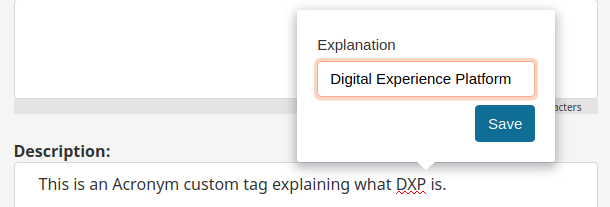
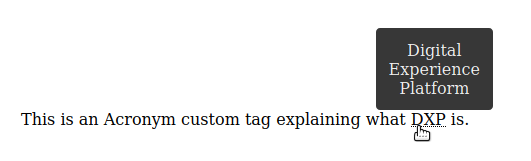
Acronym
You can create an inline custom tag that will display a hovering tooltip with an explanation of an acronym.
1 2 3 4 5 6 7 8 9 10 11 12 13 14 15 16 | |
The explanation attribute will contain the meaning of the acronym that will be provided
while editing in the Online Editor.
Label translations can be provided in app/Resources/translations/custom_tags.en.yaml:
1 2 | |
In the template file acronym.html.twig provide the explanation as attr_value
to the title of the abbr tag:
1 | |
Custom toolbars
You can extend the Online Editor with the custom toolbars. The feature depends on Alloy Editor.
Preparation of the custom toolbar starts with creating a new toolbar config. If you want to learn how to do it, see Creating a Toolbar.
Next, add the toolbar config to the ezplatform-admin-ui-alloyeditor-js entry using encore.
Finally, add the toolbar JavaScript class to ezAlloyEditor.customSelections.<TOOLBAR_NAME> eZ config.
You can do it at the bottom of the toolbar config file:
1 | |
With this step, the ContentVariableEditConfig toolbar is injected and ready to be used.
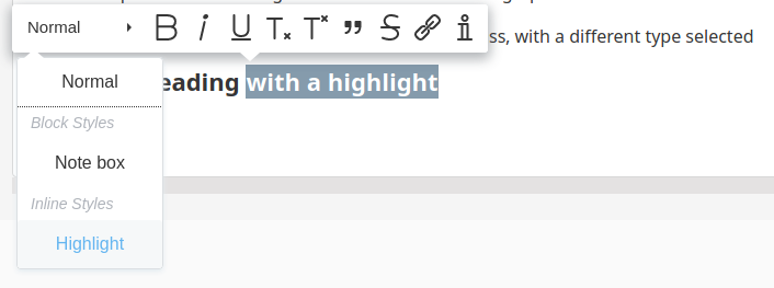
Custom styles
You can extend the Online Editor with custom text styles. The feature depends on Alloy Editor styles. The styles are available in the text toolbar when a section of text is selected.
There are two kinds of custom styles: block and inline. Inline styles apply to the selected portion of text only, while block styles apply to the whole paragraph.
Back Office configuration
The sample configuration is as follows:
1 2 3 4 5 6 7 8 9 10 11 12 13 14 15 | |
The system expects two kinds of configuration:
- a global list of custom styles, defined under the node
ezrichtext.custom_styles, - a list of enabled custom styles for a given Admin SiteAccess or Admin SiteAccess group, located under the node
ezpublish.system.<scope>.fieldtypes.ezrichtext.custom_styles
Note
Defining this list for a front site SiteAccess currently has no effect.
Translations
Labels that appear for each custom style in the Online Editor need to be translated using Symfony translation system.
The translation domain is called custom_styles. For the code example above, you can do it in a app/Resources/translations/custom_styles.en.yml file:
1 2 | |
Rendering
The template key points to the template used to render the custom style. It is recommended to use the design engine.
In the example above, the template files for the front end could be:
app/Resources/views/themes/standard/field_type/ezrichtext/custom_style/highlighted_word.html.twig:
1 | |
app/Resources/views/themes/standard/field_type/ezrichtext/custom_style/highlighted_block.html.twig:
1 | |
Templates for Content View in the Back Office would be app/Resources/views/themes/admin/field_type/ezrichtext/custom_style/highlighted_word.html.twig and app/Resources/views/themes/admin/field_type/ezrichtext/custom_style/highlighted_block.html.twig respectively (assuming Admin SiteAccess uses the admin theme).
Use cases
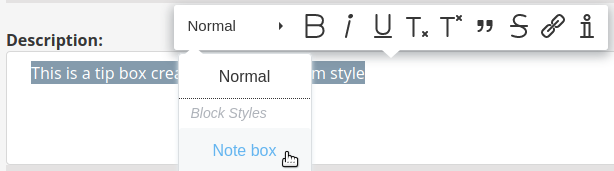
Note box
You can create a custom style that will place a paragraph in a note box:
1 2 3 4 5 6 7 8 9 10 11 | |
The indicated note_box.html.twig template wraps the content of the selected text ({{ content }})
in a custom CSS class:
1 | |
1 2 3 4 5 6 7 8 9 | |
Label translation can be provided in app/Resources/translations/custom_styles.en.yaml:
1 | |
Tip
You can also create a similar note box using custom classes.
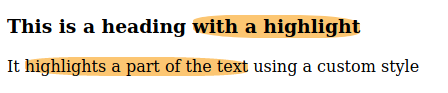
Text highlight
You can create an inline custom style that highlights a part of a text:
1 2 3 4 5 6 7 8 9 10 11 12 | |
The indicated highlight.html.twig template wraps the content of the selected text ({{ content }})
in a custom CSS class:
1 | |
1 2 3 4 | |
Label translation can be provided in app/Resources/translations/custom_styles.en.yaml:
1 | |
Custom data attributes and classes
You can add custom data attributes and CSS classes to elements in the Online Editor.
The available elements are:
embedinlineembedformattedheadingembedimageulolliparagraphtabletrtd
Overriding embed templates
If you override the default templates for embedinline, embed or embedimage elements,
(e.g. EzPublishCoreBundle:default:content/embed.html.twig),
the data attributes and classes will not be rendered automatically.
Instead, you can make use of the data_attributes and class properties in your templates.
The ez_data_attributes_serialize helper enables you to serialize the data attribute array.
Custom data attributes
Custom data attributes are configured under the fieldtypes.ezrichtext.attributes key.
The configuration is SiteAccess-aware.
A custom data attribute can belong to one of four types: choice, boolean, string, or number.
You can also set each attribute to be required and set its default_value.
For the choice type, you must provide an array of available choices.
Adding multiple enables you to choose whether more than one option can be selected.
It is set to false by default.
The example below adds two data attributes, custom_attribute and another_attribute
to the Heading element:
1 2 3 4 5 6 7 8 9 10 11 12 13 14 15 16 17 | |
This configuration will output data-ezattribute-<attribute_name>="<value>" in the corresponding HTML element,
in this example as data-ezattribute-custom-attribute="false" and data-ezattribute-another-attribute="attr1,attr2".
Custom CSS classes
Custom CSS classes are configured under the fieldtypes.ezrichtext.classes key.
The configuration is SiteAccess-aware.
You must provide the available choices.
You can also set the values for required, default_value and multiple.
multiple is set to true by default.
The example below adds a class choice to the Paragraph element:
1 2 3 4 5 6 7 8 9 10 11 12 | |
Label translations
You can provide label translations for custom attributes with the translation extractor ez_online_editor_attributes.
It gets a full list of custom attributes for all elements in all scopes.
For example:
1 2 | |
Use cases
Note box
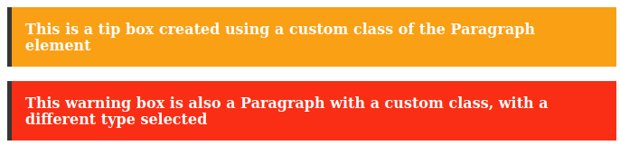
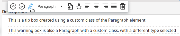
You can create a custom class that will enable you to place a paragraph element in a note box:
1 2 3 4 5 6 7 8 9 10 11 | |
This enables you to choose one of the following classes for each paragraph element: regular, tip_box, or warning_box
that you can then style individually using CSS.
Tip
You can also create a similar note box using custom styles.
Custom plugins
You can add your own plugins to the Online Editor.
For more information, follow Creating Online Editor plugin.
You can also download an existing plugin from the CKEditor. In this case, include it in a page after AlloyEditor is loaded:
1 2 3 | |
The name of a plugin needs to be the same as the one passed to CKEDITOR.plugins.add in the plugin source code.
Please keep in mind that if a plugin changes RichText input (in xhtml5/edit format for DocBook), the changes need to be supported by RichText Field Type. For example, if a plugin adds some class to some element, you need to confirm that this class is stored when saving or publishing content (it could result in either XML validation error or could be omitted by RichText processor).
Buttons configuration
Custom buttons can be added to your installation with the following configuration:
1 2 3 4 5 | |
Under extra_buttons (line 4) specify to what toolbar you want to add a new button e.g. paragraph.
Next to that toolbar, add an array with names of custom buttons that you want to install e.g. [buttonName1, buttonName2].
All new buttons should also be added to AlloyEditor under the same name that's in the configuration file. For more information follow AlloyEditor tutorial on creating a button.