Block reference
The following blocks are provided with a clean installation of Ibexa DXP:
| Block | Description |
|---|---|
| Banner | Displays an image content item with a URL attached to it. |
| Campaign | Displays a campaign selected from Ibexa Engage. |
| Catalog | Displays products from a specific catalog to a selected customer group. |
| Code | Enables you to place content on your page, for example, text, links, or images, using custom HTML. |
| Collection | Displays a set of content items you select manually from the content structure. |
| Content List | Displays content items of a chosen content type (or types) that are contained in a selected folder. |
| Content Scheduler | Displays content items at a pre-defined time. |
| Embed | Embeds a content item of any content type on the page. |
| Form | Embeds a Form content item that you select from the content structure. |
| Gallery | Displays all images contained in a selected folder. |
| Ibexa Connect | Retrieves and displays data from an Ibexa Connect webhook. |
| Orders | Displays a list of orders associated with a particular company or individual customer. |
| Product collection | Displays a list of specifically selected products. |
| Product embed | Displays a specific product. |
| RSS | Loads and displays news from RSS feeds (channels). |
| Sales representative | Loads and displays company's sales representative. |
| SeenThis! | Displays video with exceeded standard video restrictions of 3.5MB. |
| Targeting | Embeds an content item based on the segment the user belongs to. |
| Text | Enables you to add to the page a Rich Text block. |
| Video | Embeds a video into the page with standard playback controls. |
Note
For recommendation blocks provided by the Raptor integration, see Recommendation block reference.
Page Builder has two main views that you can use while creating a page:
- Page blocks toolbox - consists of all available elements that you can use by dragging them and dropping on a drop zone.
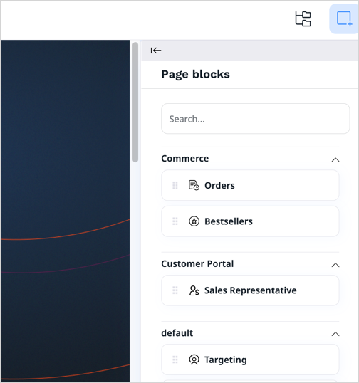
- Structure view toolbox - shows a structure of your page, including their division into zones and the blocks that they contain.
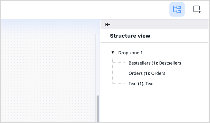
Block basics
Handling blocks is straightforward, drag and drop them into the desired spot within the drop zone. There's no need to worry about getting their placement perfect initially, you can rearrange them whenever you need.
Settings
You have the ability to control individual blocks by accessing their settings. Click on the settings icon next to the block's name.

The settings include:
- Move Up — change the block's position by shifting it upwards.
- Move Down — change the block's position by shifting it downwards.
- Configuration — access the configuration window.
- Duplicate — create a copy of the block below the original, including its settings.
- Refresh — update the block's preview.
- Delete — remove the existing block.
Design tab
In the block configuration, on the Design tab, under the View field, you can select the layout for presenting a block.
Scheduler tab
In the block configuration, on the Scheduler tab, you can set a date for the block to be revealed or hidden.
Standard blocks
Banner block
The banner block showcases an image linked to a specific URL. It can be used for creating visually appealing banners or promotional sections on websites that require linked images to direct users to specific pages or content. On the Properties tab, set values in the following fields:
- Name — Enter a name for the page block.
- Image — Click Select content, browse the available content, and choose an image for display.
- URL — Enter a URL that opens when users click on the banner block.
Campaign block
Displays a campaign created and configured in Ibexa Engage. On the Properties tab, set values in the following fields:
- Name – Enter a name for the campaign.
- Campaign – Select a campaign that you want to display on the page. The list contains only those campaigns from your Qualifio account, which are active or scheduled to launch in the future.
Catalog block
Shows products from a chosen catalog tailored for a particular group of customers, ensuring a personalized browsing experience.
Before you configure this block, make sure that there are catalogs that are defined and published in your product catalog. On the Properties tab, set values in the following fields:
- Name – Enter a name for the page block.
- Default catalog – Select a catalog that is displayed to end-users who are anonymous or not part of any customer group assigned to specific catalogs.
- Set up customer group and catalog — Add at least one assignment: add a row, then select a customer group and a matching catalog.
- Display limit – Set the number of products to be displayed.
On the Design tab, in the View field, select the layout to be used to present a list of products and submit your changes.
Code block
Enables you to use custom HTML to add customized text, links, images, and more to your page. On the Properties tab, set values in the following fields:
- Name — Enter a name for the page block.
- Content — Enter the HTML code for the content you want to display.
Collection block
Displays a collection of content items manually selected from the content structure, allowing you to feature specific content for promotional campaigns or highlight essential information on your website. On the Properties tab, set values in the following fields:
- Name — Enter a name for the page block.
- Location list — Click Select content, browse the available content, and add to the collection content items of any content type you want.
All selected content items appear in the Selected items box at the bottom of the window. When done selecting, click Confirm.
Content List block
Displays content items of specified content type from a selected folder, simplifying access to categorized information or targeted content presentation on your site. On the Properties tab, set values in the following fields:
- Name — Enter a name for the page block.
- Parent — Click Select content, browse the content, and select a folder containing content items to display in the list.
- Limit — Set the number of products to be displayed.
- Content types to be displayed — Select content type(s) to be displayed.
Embed block
Place any content item directly on the page. This function works across all content types seamlessly. On the Properties tab, set values in the following fields:
- Name — Enter a name for the page block.
- Content — Click Select content, browse the content, and select a content item.
Form block
Place a selected form from the content structure onto the page. Integrate specific forms into your content to enhance client interaction. Completing the settings of the Form block requires at least one Form content item created.
On the Properties tab, set values in the following fields:
- Name — Enter a name for the page block.
- Form — Click Select content, browse the content, and select a Form content item to append it to the block.
Known limitation
To display two or more identical forms on a single page, have your developer create multiple identical form blocks for your use. This prevents potential issues related to duplicate data submission.
For more information about creating form blocks, see Creating a newsletter form in Developer Documentation.
Gallery block
Presents a comprehensive visual array by displaying all images from your selected folder. On the Properties tab, set values in the following fields:
- Name — Enter a name for the page block.
- Folder — Click Select content, browse the content, and select a folder containing images to display.
After submitting the settings, all images in the folder are shown in the Gallery block. Selecting a folder containing content items other than images results in displaying only a link to the folder where they're stored.
Ibexa Connect block
Access and showcase data retrieved from an Ibexa Connect webhook. Streamline information presentation for seamless insights and improved decision-making. On the Properties tab, set values in the following fields:
- Name – Enter a name for the page block.
- Webhook link — Enter the link for the Ibexa Connect webhook.
Using Ibexa Connect scenario block
For more information about using Ibexa Connect scenario block, see Ibexa Connect scenario block in Developer Documentation.
Orders block
Showcases a list of orders linked to a specific company or individual customer. Helps track purchase history for streamlined customer service and personalized interactions. On the Properties tab, set values in the following fields:
- Name – Enter a name for the page block.
- Columns — Select columns that should be displayed in the orders table. Some columns are preselected, for example, Order ID, Customer name, or Total value.
- Statuses — Set the statuses of orders that should be included in the list.
- Number of orders — Set the number of orders to be displayed.
- Sort order — Set the sort order for the displayed orders.
Product collection block
Presents curated collections of items for easier exploration and discovery. On the Properties tab, set values in the following fields:
- Name – Enter a name for the page block.
- Product list — Create a list of products. Either enter a comma-separated list of product codes and click Add, or click Select products, select products, and click Confirm.
Product embed
Presents a single product, allowing you to highlight its key features. On the Properties tab, set values in the following fields:
- Name – Enter a name for the page block.
- Product code — Enter the product code and click Add or click Select products. Then, select a single product, and click Confirm.
RSS block
Imports and showcases news content from RSS feeds (channels), helping users stay informed with the latest updates and diverse news sources. On the Properties tab, set values in the following fields:
- Name – Enter a name for the page block.
- URL — Enter the URL for the RSS news feed.
- Limit — Set the number of news items to be displayed.
- Offset — Set the limit of featured news items to be displayed.
Sales representative
Imports and showcases sales representatives for the company in the Customer Portal. Gives users a way to connect with the team that handles their sales needs. On the Properties tab, set values in the following fields:
- Name – Enter a name for the page block.
On the Design tab, in the View field, select the layout to be used to present the Sales representative's details view and submit your changes.
SeenThis! block
Integration with SeenThis! service. SeenThis! block provides an adaptive streaming technology with no limitations as conventional streaming service. It allows to preserve the best video quality with minimum amount of data transfer.
Note
This page block is in an opt-in bundle, to use it, install ibexa/connector-seenthis bundle first.
On the Properties tab, set values in the following fields:
- Name – Enter a name for the page block.
- Video ID – Enter the ID of the video to be streamed.
- Tracker ID – Enter the tracking code.
- Big play button – Set to display a large play button.
- Autoplay – Configure whether the video starts automatically.
- Muted – Configure whether the video starts muted.
- Play button – Set the number of products to be displayed.
- Mute button – Set whether the mute button is displayed or not.
- Loop – Set whether to play a video in a loop mode.
- Loop count – Set the number of loop repetitions.
- Include audio – Configure whether to include audio with the video.
Note
SeenThis! technology might be blocked by some ad blocker solutions. If you can't see the block once configured, check the ad blocker configuration.
Targeting block
Targeting block provides recommendation of content based on users related to the configured segments.
On the Properties tab, set values in the following fields:
- Name – Enter a name for the page block.
- Select default content — Click Select content, browse the content, and choose the default content item to display when no priority rules are valid.
- Setup segment and content matching priority rules — Select a segment group and a segment, then click Select content and navigate to the content item that you want to display for the selected group.
The rules are checked in order, so when a user belongs to more than one segment, the first rule applies.
For example, consider the following configuration:
| Segment | Content displayed |
|---|---|
| Segment A | Content 1 |
| Segment B | Content 2 |
| Segment C | Content 3 |
To a user who belongs to Segment A, Segment B, and Segment C, Content 1 is displayed, because the block evaluates rules from top to bottom and stops at the first match. Even though the user also belongs to Segment B and Segment C, those rules are never evaluated in this case.
You can preview the page for each of the available segments:
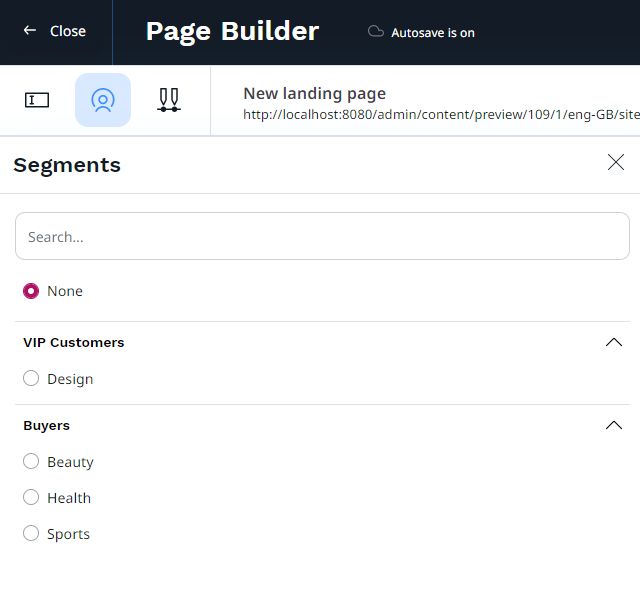
Text block
Adds a Rich Text block to the page. On the Properties tab, set values in the following fields:
- Name – Enter a name for the page block.
- Content — Enter a content, for example, text, images, or videos, with the online editor. For details, see Editing Rich Text Fields.
Use AI to improve text
If AI Actions have been configured in your application, the Improve text button is visible. If you have necessary permissions, you can click it to request that the AI Assistant performs specific tasks with your text.
For more information, see AI Assistant.
Video block
Integrates a video into the page with standard playback controls. Helps enhance content variety and captivate audiences with seamless video viewing. On the Properties tab, set values in the following fields:
- Name – Enter a name for the page block.
- Video — Click Select content, browse the content, and select a video to display in the block.
On the Properties tab you can preview the selected video before adding it to the page.
Recommendation blocks
One of the elements of the Raptor integration is the addition of recommendation blocks. For more information, see Recommendation block reference.