Pages
Page is a special Content Type that contains zones onto which you can drop different dynamic blocks. You can edit it to personalize the layout and contents of your website.
Tip
The Page Content Type contains a Landing Page Field Type which manages the zones and blocks. Any Content item that has the Landing Page Field Type will behave like the Page Content Type.
Creating Pages
To create a new Page, in the upper toolbar click Content and from the list below select Content structure. On the right-side toolbar, click Create and from the list of Content items select Landing page. On the Page creation modal, select the layout and click Create draft.
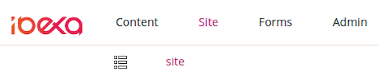
You can also add a new Page in the Page Builder. Open the Page Builder by clicking Site and selecting a site from the list that appears next to the List icon. On the Page Builder toolbar click the plus button and from the list select Landing page. On the Page creation modal, select the layout and click Create draft.
Before publishing or saving the Page, edit its title and description. Switch to the Field view using the Page Builder toolbar.
Autosave
To help you preserve your work, Ibexa DXP saves drafts of Content items automatically. For more information, see Autosave.
Editing Pages
You edit Pages using the Page Builder. To start editing an existing Page, in the Back Office click Page and select the page from the list that appears below.
Page Builder toolbar
The Page Builder comes with a toolbar that enables you to perform advanced editing and previewing of the Page.

Using the toolbar buttons, you can perform the following actions:
| Button | Description |
|---|---|
 |
Switch between previewing and editing the Page. |
 |
Switch between the Page view and the Field view. |
 |
Access preview of the Page for a given Segment. |
 |
Toggle through to see how the Page is rendered on different devices. |
 |
Access the timeline to preview how the Page changes with time. You can also view the list of all upcoming scheduled events. For details, see Timeline. |
 |
Access menu enabling you to switch layout, see versions of the Page, manage translations, or delete the Page. |
 |
Create a new Content item. |
In a newly created Page you must first choose a layout which defines the available zones. You can switch it later by using the following menu:

Applying a layout divides the Page into the defined zones. The zones are placeholders for Content items. Now you are ready to add blocks of content to the Page.
Adding blocks
In Page Builder you can access a menu of Elements — a set of blocks of content that you can add to the zones of the Page. Each block is unique in its function and enables you to customize the content appearing on the Page.

Add a block by dragging it from the menu to an empty place on a zone. Do not worry about placing blocks in the proper place from the start. You can reorder them at any time by dragging and dropping them in the desired location.
{{ product_name_ee }} comes with a set of ready-to-use Page blocks, but developers can add their own.

The blocks provided with a clean installation of {{ product_name_ee }} are:
| Block | Description |
|---|---|
| Targeting | Embeds a Content item depending on the Segment the user belongs to. For details, see Targeting block. |
| Form | Embeds a Form Content item that you select from the Content Structure. For details, see Form block. |
| Code | Enables you to place text, links, images, etc. on your Page using custom HTML. For details, see Code block. |
| Content List | Displays Content items of a chosen Content Type (or Types) that are contained in a selected folder. For details, see Content List block. |
| Banner | Displays an image Content item with a URL attached to it. For details, see Banner block. |
| Collection | Displays a set of Content items you select manually from the Content structure. For details, see Collection block. |
| Embed | Embeds a Content item of any Content Type on the Page. For details, see Embed block. |
| Gallery | Displays all images contained in a selected folder. For details, see Gallery block. |
| Video | Embeds a video into the Page with standard playback controls. For details, see Video block. |
| RSS | Loads and displays news from RSS feeds (channels). For details, see RSS block. |
| Content Scheduler | Displays Content items at a pre-defined time. For details, see Content Scheduler block. |
| Text | Enables you to add to the Page a Rich Text block. For details, see Text block. |
Block settings
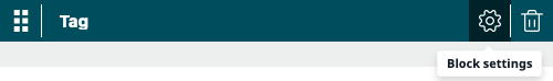
Each kind of block has its special properties. You can access them by placing the cursor on the added block and clicking the Block settings (cog) icon. Use the same menu to remove the block from the Page by clicking the Delete (trash) icon.
Settings available for blocks are divided into three tabs — Basic, Design, and Scheduler. The settings available on the Basic tab are tailored to the block's content.
The remaining tabs contain parameters common to all blocks provided with Ibexa DXP. Use them to modify the layout and visibility of a block. For details, see Scheduling publication.
You cannot publish a Page if you have not set all the required settings of all blocks.
Tip
Settings and function of custom-made blocks of content depend on their design. For details on adjusting and using them, contact your website administrator.
After you change the block settings, click Submit to save the changes or Discard to cancel.
Targeting block
On the Basic tab, perform the following actions:
- In the Name box, provide the name of the block.
- In the Select default content section, click Select content, navigate through the content and select the default Content item that will be displayed when no priority rules are valid.
- In the Setup segment and content matching priority rules section, select a Segment Group and a Segment, then click Select content and navigate to the Content item that you want to display for the selected group.
The rules are checked in order, so if a user belongs to more than one Segment, the first rule applies.
You can preview the page for each of the available Segments:
Form block
Note that completing the settings of the Form block requires at least one Form Content item created.
On the Basic tab, perform the following actions:
- In the Name box, provide the name of the block that will appear on the Page.
- In the Form section, click Select content, navigate through the content and select a Form Content item to append it to the block.
Known limitation
To present two or more identical forms on one Page, ask your developer to create several identical form blocks that you can then use. Otherwise you may encounter issues with duplicate data submission.
For more information about creating form blocks, see Creating a newsletter form in developer documentation.
Code block
On the Basic tab, perform the following actions:
- In the Name box, provide the name of the block that will appear on the Page.
- In the Content box, enter the HTML code for the content you want to display on the Page.
Content List block
On the Basic tab, perform the following actions:
- In the Name box, provide the name of the block that will appear on the Page.
- In the Parent section, click Select content, navigate through the content and select a folder containing Content items to display on the list. Click Confirm.
- In the Limit section, enter a number or use the up and down buttons to set the limit of Content items to display.
- From the Content Types to be displayed list, select Content Type(s) to be displayed. The block will display Content items of the selected Content Types that are in the selected parent folder.
Banner block
On the Basic tab, perform the following actions:
- In the Name box, provide the name of the block that will appear on the Page.
- In the Image section, click Select content, navigate through the content and select an image to display.
- In the URL box, enter a URL to open when clicking the selected image.
Collection block
On the Basic tab, perform the following actions:
- In the Name box, provide the name of the block that will appear on the Page.
- In the Location list section, click Select content, navigate through the content and add to the collection Content items of any Content Type you want. All selected Content items appear in the Selected items box at the bottom of the window. When done selecting, click Confirm.
Embed block
On the Basic tab, perform the following actions:
- In the Name box, provide the name of the block that will appear on the Page.
- Select content to embed by clicking Select content. Navigate to a Content item, select it and click Confirm.
Gallery block
On the Basic tab, perform the following actions:
- In the Name box, provide the name of the block that will appear on the Page.
- In the Folder section, click Select content, navigate through the content, select a folder containing images to display and click Confirm. After submitting the settings, all images in the folder will appear in the Gallery block. Note that selecting a folder containing Content items other than images results in displaying only a link to the folder they are stored in.
Video block
On the Basic tab, perform the following actions:
- In the Name box, provide the name of the block that will appear on the Page.
- In the Video section, click Select content, navigate through the content, select a video to display in the block and click Confirm. On the Basic tab you can preview the selected video before adding it to the Page.
RSS block
On the Basic tab, perform the following actions:
- In the Name box, provide the name of the block that will appear on the Page.
- In the URL box, provide the URL for the RSS news feed.
- In the Limit box, enter a number or use the up and down buttons to set the limit of news items appearing in the block.
- In the Offset box, enter a number or use the up and down buttons to set the limit of featured news items appearing in the block.
Text block
On the Basic tab, perform the following actions:
- In the Name box, provide the name of the block that will appear on the Page.
- In the Content box, enter text, images, videos, etc. using the Online Editor. For details, see Editing Rich Text Fields.
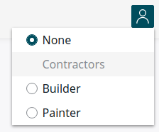
Personalized block
On the Basic tab, set values in the following fields:
- Block name – Optionally, enter a name for the page block, for example, "Bestsellers".
- Select a scenario – Select "Landing page" or "Top clicked".
- Select a Content Type... – Select "Product".
- Display limit – Set the number of products to be displayed, for example, 4.
On the Design tab, in the View field, change the layout to "Products" and submit your changes.
Configure block display
As an administrator, you can define which page blocks elements are available for an editor in the page edit mode.
Go to the Content Type that you want to edit. In the Field definitions section, click the Landing page tab. Expand the Select blocks section, and select page blocks.

To apply changes, click Save.
Now, only selected page blocks are available in the edit mode.

Caution
When you deselect blocks, any related blocks that are included in the Landing page hide as well. To publish the Page, a user has to delete these blocks from the Landing Page.
Add new blocks
If a developer creates a new block and you want to make it available in the editor mode, you must select it manually in the Select page blocks section.
Configure preferred edit mode
As an administrator, you can set the edit mode that is launched when an editor starts editing the Page.
Go to the Content Type that you want to edit. In the Field definitions section, click the Landing page tab. Expand the Select Editor launch mode section, and select from the available options.

Configure available page layouts
As an administrator, you can configure which page layouts are available for an editor. On the Admin tab, click Content Types. Go to the Content Type that you want to edit. In the Field definitions section, expand the Landing page tab. Expand the Select layouts section, and define which layout will be available for this Page. To apply changes, click Save.
If you deselect a layout that is currently used, the user has to change the layout to be able to edit the Page.

Publishing Page
If you are ready to publish the Page, click Publish in the top-right corner. To save it as a draft to finish editing it later, even if some required fields are not filled in, click Save draft. You can then navigate away from the Page by clicking the logo in the upper left corner, or the browser's Back button.